

You know the feeling. A report lands in your inbox, full of colour blocks, percentages, and abbreviations, and you still can't tell whether your child is thriving, drifting, or struggling. In online schooling, that uncertainty can feel sharper, because you don't get the same day-to-day view you'd have in a traditional classroom, so the written record has to do more of the heavy lifting.
That's where performance analytics earns its place. At its best, it turns scattered school data into a clear story about a real child, so a parent can see what matters, a teacher can respond sooner, and a young person can get support before a small issue becomes a bigger one. If you've ever wanted a plain-English guide to reading reports without feeling lost, a useful place to start is tracking performance in 2026, because the logic of measuring what matters depends on the same core idea, useful signals need context, not just numbers.
In a good school, those signals are never treated as a scoreboard. They're part of a child-first trust layer, one that asks a simple question, what does this data mean for support, confidence, and next steps?
What a Confusing Progress Report Really Means
A parent often opens a report before they understand the story behind it. One column says attendance, another says progress, another uses a colour the family has never seen before, and none of it answers the main worry, is my child doing okay? In online education, performance analytics matters because it turns scattered figures into a conversation a family can act on.
From numbers to a useful story
At its simplest, analytics is the work of collecting school evidence, checking what it means, and joining it together so adults can see patterns. In an online setting, that matters even more because live teacher contact is limited compared with a physical classroom, so the report has to carry more of the picture. A good system does more than say a student attended. It shows whether that attendance sits beside assignment completion, assessment confidence, or a drop in participation.
Practical rule: if a report creates more worry than clarity, the problem is usually not the child. It is the way the data has been assembled or explained.
The parent's job is not to decode every spreadsheet line. The school's job is to translate the data into decisions, such as whether a student needs a check-in, a deadline adjustment, or a different way of learning. In a good school, those signals form a child-first trust layer that asks a simple question, what does this data mean for support, confidence, and next steps?
For a wider view of how organisations think about measuring what matters, tracking performance in 2026 is worth reading alongside any school report, because the same principle applies here, data only helps when it leads to action.
The three promises that matter are simple, clarity for parents, sharper support for students, and trustworthy handling of sensitive information. If a report does not serve those three, it is probably giving you noise, not insight.
Defining Performance Analytics in Plain English
A parent opening a school report often wants one clear answer, is my child being supported in the right way? Performance analytics helps the school answer that question by looking at several kinds of evidence together, so adults can decide what comes next. One mark on its own is rarely enough. One attendance figure on its own is rarely enough. The pattern is what matters.
What it joins together
In education, that pattern usually includes attainment, progress, engagement, and wellbeing. In the UK, this way of reading school performance already shapes formal accountability, because the Department for Education introduced Progress 8 in 2016 as the headline measure for secondary schools in England, judging pupils' progress across eight qualifications rather than looking at attainment alone, and Ofsted's 2019 framework pushed schools to think more carefully about curriculum quality, intent, implementation, and impact rather than just end results.
For an online learner, the same idea needs to work more like a joined-up check on daily learning. Live-class attendance, assignment submission latency, and recorded-session replays all become part of the evidence base. A student who watches every replay but never joins live may need a different support plan from one who attends live but submits work late, and both situations mean something very different from a grade by itself.
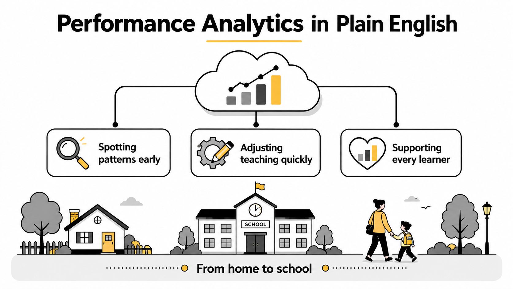
The child-centred question underneath all of it is simple, is this learner progressing, and what kind of support does that progress need? Once a report answers that well, it feels less like a puzzle and more like a practical tool for care.
A simple mental model
A useful way to picture analytics is as the bridge between home and school. Attendance only tells you someone turned up. Attainment only tells you what they scored. Progress shows whether they are changing from their starting point, which is often the part families care about most.
That is the difference between raw data and helpful guidance. Raw data sits still. Performance analytics gives it meaning.
The Four Metric Families Every Parent Should Recognise
A useful report usually sorts into four families. If you can name them, you can read almost any school dashboard with more confidence, and you're less likely to mistake one number for the whole truth.
A quick comparison
| Metric family | What it measures | Typical online school example | Common trap |
|---|---|---|---|
| Attainment | What a learner has achieved at a point in time | GCSE grades or standardised test scores | Treating a single result as the full picture |
| Progress | Movement from a baseline over time | Progress 8-style comparison or teacher-tracked improvement | Confusing steady effort with strong outcome, or vice versa |
| Engagement | How consistently a learner is taking part | Live attendance, submission timing, forum participation | Assuming high engagement always means strong understanding |
| Wellbeing | How the learner is coping day to day | Mood check-ins, pastoral notes, teacher observation | Reading a temporary dip as a permanent problem |
What each family really tells you
Attainment is the easiest to spot, because it shows the result. It might be a grade, a score, or a level. The trap is obvious, a good result can hide a hard journey, and a weaker result can hide a lot of progress.
Progress answers a different question, how far has the student moved from where they started? That's why measures like Progress 8 matter in UK schooling, because they shift attention from raw attainment alone to development over time.
Engagement is about participation. In online education, that can include whether a learner joins live lessons, sends work on time, and takes part in discussion. A common mistake is to treat engagement as a moral judgement, when it's often just a sign that a student's routine, confidence, or access needs attention.
Wellbeing is the most easily misunderstood. It may come from check-ins, tutor notes, or support conversations, and it should never be treated as a stand-alone verdict. One rough week does not define a child.
Common sense check: if one metric looks worrying but the other three look stable, pause before making a big judgement. Ask what changed, and when.
That four-part view helps parents move from panic to perspective.
Personalised Learning and SEN/SEMH Support in Practice
A strong analytics system doesn't just describe a child. It helps adults adjust support before the child feels written off. That matters especially for students with SEN or SEMH needs, where small changes in routine or confidence can show up in the data before they show up in a conversation.
A representative pattern
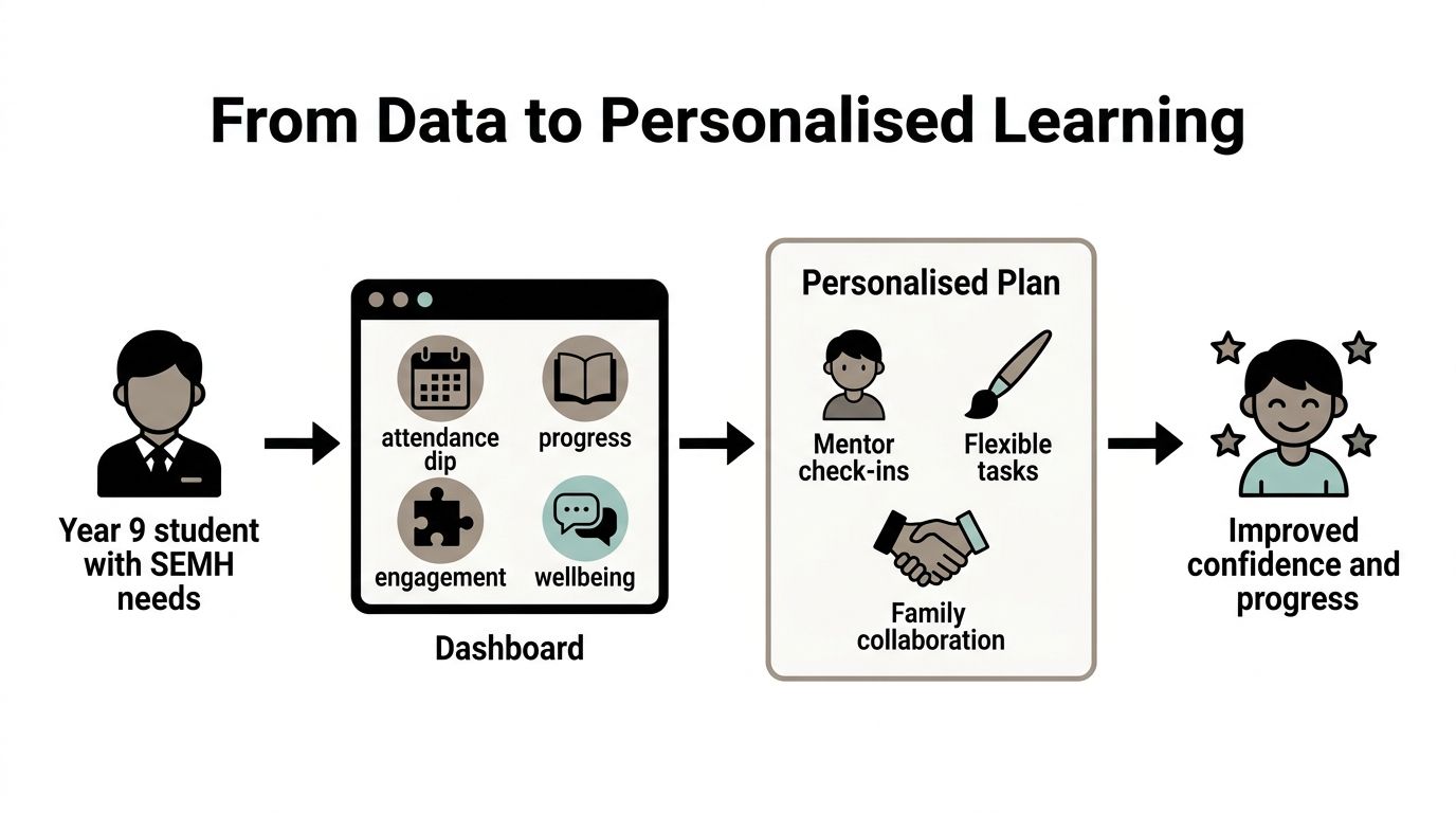
Take a Year 9 student whose attendance dips, whose work starts arriving later, and whose self-reported wellbeing falls at the same time. On their own, each signal might look minor. Together, they say something important, the student may be losing bandwidth, not effort.
That is the point where the form tutor, SEN coordinator, and parent can act together. The response might include adjusted deadlines, a wellbeing check-in, or a one-to-one live session. The goal is not to pile on extra interventions. It's to remove friction before mock results take the hit.
The best practice here is straightforward, look for a cluster rather than a single spike. If attendance changes, ask whether submissions changed too. If both changed, ask whether confidence, home routine, or workload is part of the picture. That's what makes the data useful, because it points to support that fits the child rather than a generic fix.
You can see the same child-centred logic in Queen's Online School's data-driven education approach, where the emphasis is on using information to shape support, not just to record outcomes. When analytics is working well, the report becomes a route to earlier help, not a label after the fact.
What parents should ask for
- Which signs are early warning signs? Attendance, submission delay, and wellbeing are often the first place to look.
- Who is responsible for the next step? A child needs one clear adult, not a chain of vague promises.
- What will change in the plan? Support only matters if it changes something concrete for the learner.
That's how personalised learning becomes more than a slogan. It becomes a set of actions tied to the child's real day.
How Parents and Students Can Read Reports and Act on Them
A report becomes useful when a family knows how to read it calmly. Start with the baseline, because without the starting point, a number can look better or worse than it really is. Then look for the trend line, because a pattern over time tells you more than a single point.
A simple reading routine
First, separate attainment from progress. A student can have a modest grade and still be making strong progress from a low starting point. A student can also have a strong grade and be making very little movement, which matters if they're capable of more or losing momentum.
Second, look for the narrative around the numbers. A short comment from a tutor, pastoral lead, or subject teacher should explain what the figures are trying to tell you. If the numbers and the explanation don't match, ask about the source.
Ask for the story behind the score, not just the score itself.
Three questions that help in a meeting
- What changed since the last report? This keeps the conversation anchored in movement, not just status.
- Which metric are you most concerned about? This forces clarity, because every child's report has one or two areas that matter most.
- What is the agreed next step? A good meeting ends with ownership, timing, and a follow-up point.
Students can build the same habit at home.
- Review the report within 48 hours. Early reflection helps the detail stay fresh.
- Write down two targets. One can be academic, one can be about routine or engagement.
- Share the report with a trusted adult. Support works better when the learner isn't carrying it alone.
If a report shows a fall in live-class attendance, the action plan should be specific. The tutor checks whether the issue is timetable, confidence, device access, or something else. The parent knows who will follow up. The student knows what changes next week. That's a sensible use of data, clear, human, and focused on the child rather than the chart.
Dashboards Versus Termly Reports and How Often to Update Them
Parents often get two very different views of the same child. One is a live dashboard, full of quick signals and fresh data. The other is a termly report, written carefully and designed to explain the bigger picture. Both matter, but they serve different moods and different needs.
Real time versus reflection
A dashboard works well when you want early warning. It can show whether attendance has dipped, whether a task was missed, or whether a trend is starting to shift. The downside is that it can make anxious families watch every wobble as if it were a crisis.
A termly report gives context. It can explain why a metric moved, what support was put in place, and how the child responded over a longer span. The downside is that it can arrive after the moment when a quick intervention would have helped most.
A blended approach is usually best, and it mirrors the way good online schools handle pastoral oversight, with live data used for early triggers and termly reporting used for parent-facing summaries. If you're also interested in how frequent review supports web and content performance, DOM Studio's guide on Core Web Vitals is a useful parallel, because the right update rhythm makes signals easier to act on.
| Format | Strength | Limitation |
|---|---|---|
| Dashboard | Fast, granular, good for check-ins | Can overwhelm or overstate small changes |
| Termly report | Context-rich, calmer, better for reflection | Slower to show emerging concerns |
A sensible update rhythm
- Live engagement data should be refreshed at least weekly.
- Attainment data should be refreshed at each assessment point.
- Wellbeing data should be checked termly, with a clear escalation route if concerns appear.
If you want to see how a family-facing platform can keep those signals in one place, the pupil tracker login area is the kind of entry point that makes regular review easier, because it reduces the gap between noticing a pattern and doing something about it.
The best format depends on the child. Some families want the reassurance of a live pulse. Others need the calm of a written summary first. Good analytics makes room for both.
Building a Trust Layer for Data, Privacy, and Conflicting Numbers
The hardest question in performance analytics isn't how to make a dashboard. It's how to trust what the dashboard says when different systems disagree. Attendance may be logged one way, attainment another, and wellbeing notes somewhere else entirely, often on different schedules and with different inclusion rules.
When the numbers don't match
That mismatch can mislead families if no one explains it. A student might look less engaged in one system because that platform counts a session differently. Another report may look more positive because it excludes a set of records that another team includes. The solution is not to pretend the conflict isn't there.
Good practice is a trust layer, built from data quality rules, clear source definitions, reconciliation thresholds, and named accountability. If a KPI crosses a threshold where it shouldn't be used for a decision, staff should know that. If definitions differ, the school should say so plainly.
The UK context matters here. The Office for National Statistics has warned that administrative and survey data can measure different things, so simple KPI comparison can be misleading without interpretation. That warning fits school reporting very well, because a neat chart can still be the wrong chart.
Privacy and role-based access
Parents should also know that good analytics is not open-ended surveillance. Sensitive wellbeing information should be handled separately from academic data, access should be role-limited, and families need a route to question or correct what has been recorded. The goal is accuracy and care, not exposure.
For teams looking at staffing and planning systems, best workforce planning analytics software shows how data tools rely on definition, ownership, and clean inputs before the numbers can be trusted. School reporting works on the same principle, because a dashboard is only as reliable as the data underneath it.
If you've ever had a report that felt wrong, ask three things. Where did this number come from? Who can see it? What happens if we think it's incorrect? Those questions don't weaken trust, they build it.
Communication with parents should make that process visible, because transparency is what turns data from a risk into a support tool.
Putting the Child at the Centre of Every Data Point
Every metric on a report belongs to a child with a name, a routine, a mood, and a family who cares. That's the part worth holding onto when the numbers start to feel cold. Used well, performance analytics helps adults notice trouble earlier, explain progress more clearly, and agree on support before frustration takes over.
A short parent checklist
- Know the baseline. Ask where your child started, not just where they are now.
- Sort the metric. Is this attainment, progress, engagement, or wellbeing?
- Ask one clarifying question. What changed, and why does it matter?
- Agree one next step. Every meeting should end with an owner and a timescale.
- Check the privacy route. Know who can see the data and how corrections work.
- Invite your child's view. Their explanation often reveals the story first.
The best online schools make three things visible, early warning over retrospective reporting, narrative alongside numbers, and trust through transparent data handling. That's what keeps analytics child-centred instead of dashboard-centred. When a school gets that right, the report stops being something to fear and becomes part of the care around your child.
If you want a school that treats reporting as part of pastoral care, not just administration, Queens Online School offers live online learning, specialist support, and a clear focus on helping each learner make steady, visible progress. Visit the school to see how its approach to data, teaching, and communication can help you feel more confident about your child's next step.